Uncategorized
Cybersecurity
Iptv

Our project started with our client — Limecraft — showing us what they would like, which looked something like this:
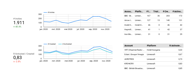
Now, it’s important to note that these statistics we see are manually generated in one of the companies that use Limecraft’s platform. Due to this, we were asked to consult on a project which automated this process.
After setting our ideas after multiple brain-storming sessions, the team concluded that the best approach would be to create a scalable and independent piece of software that generated these kinds of reports for every user.
One of the things we had to account for was the fact that we will be using Limecraft’s API to populate our database. At first, we thought using a LAMP Stack(Linux, Apache, MySQL and PHP), however, the libraries that support visualizations in PHP are scarce. In that vein, we then agreed to use Amazon’s QuickSight as a minimum viable solution, and also a chance to draft neat graphs which we would later try to re-create using the technologies we decided on.
Ultimately, we concluded on approaching this task using a more robust and flexible back-end. For that, we decided to choose Python. Primarily because Python and Data Visualizations tend to go hand in hand, and additionally, because of the Flask library which supported our back-end with scalable and fast code.
For the Data Visualization, we had decided on a popular library, Dash, which includes Plotly, a library which enables interactive graph visualization hosted on HTML pages. Obviously a great candidate to work with Flask and its impressive template functions.
At this point, we had developed a workflow for the Dashboard we intended to build. It looked something like this:
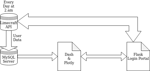
Or in plain English, we decided to populate our MySQL server with user data from the Limecraft API every night at 2am while the Flask login portal also communicated with the Limecraft API, however, in order to authenticate the user and which data in the SQL database that user can use.
Before we can do anything, we have to populate our server with data from the API. Although we only had enough privileges to work with one user at the time, we created an automation script, that with a few tweaks, could be automated to serve the users we have and the users that subscribe in the future.
To do this, we developed a python script that runs every day at 2a.m, this script additionally works in a very similar manner to the script which we use to get data for the past 6 months. The only difference is that the ‘Days’ variable will have a different number.
After using this script to upload the important data for our dashboard, our database looked something like this:
Name|Id|Deleted|Volume Ingested (s)|Items Ingested (#)|etc..|userID<br>W.L 10 Yes 0 12 91 1138
Now that the database is set and it support user authentication using the API’s AccountID/UserID, we could start up the web-server that will host our visualizations. At this point, the team had begun to split up their responsibilities. The first, making dashboards on Quicksight using our Database, and the other team, working on a Flask back-end.
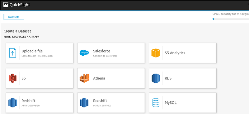
QuickSight offers a very useful service. It allows users to create Dashboards easily using a simple user interface and great pre-coded features that allow for drag and drop functionality when it comes to visualizing your database. In this chapter, I will quickly introduce how QuickSight worked with our SQL Database, and an example of the Visualizations the team had worked on.
First, an incomplete example of the kinds of databases AWS QuickSight supports:
By inputting our database into QuickSight, we could quickly set to work, with all the headers and data served in a simple and easy manner to digest. These are some of the visualizations we had created for this project:
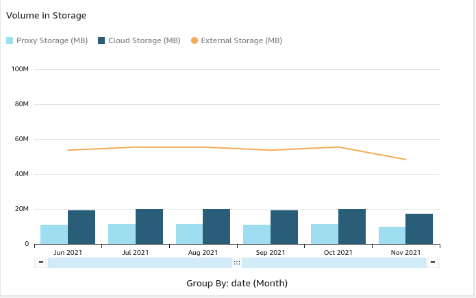
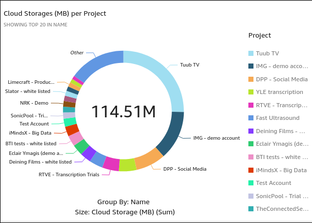
It is also very important to note that QuickSight creates interactive charts that can be easily modified for singular users. However, this approached showed some real cons: Primarily, how unflexible it is when it came to serving multiple users. It depended entirely on the IAM eco-system and it was hosted on servers outside the client’s reach. This would be understandable if this was a business analyst and these were their private dashboard, however, if this were to scale to multiple users, these kinds of interactive graphs had to be generated on a user-by-user basis.
For that reason, we decided to move on to our end-to-end system, Flask, Dash and Plotly. For more details on how we did that, please read the following chapter.
Carl Sagan once quipped that if one were to want to create an apple pie from scratch, they would have to create the universe. Dashboards are not entirely different, although, in our case, we simply had to create our eco-system, someone else developed a great library for ‘Reality’ already.
After realizing the limitations of PHP, we had begun working on a new back-end on our existing Linux cloud server. As mentioned earlier, we opted for python because of its flexibility. Our reasoning was, if one library failed to optimize, there’s always something else. And we were not entirely wrong.
For our aims, we had found a Linux, Gunicorn, Nginx and Python stack to do the job perfectly, as it would fulfill our needs for visualization and hosting. For more details on how we managed to connect Gunicorn, Nginx and Flask, please read this article:
[embed]https://www.digitalocean.com/community/tutorials/how-to-serve-flask-applications-with-gunicorn-and-nginx-on-ubuntu-18-04[/embed]
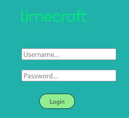
After successfully setting up our Flask application as a linux service through nginx and gunicorn, we began programming the basics of the flask application. First we started with the appropriate pages, their functions and their templates. Flask allows for python results to be hosted into a template HTML page, which makes this process very simple. The first iteration of our Flask application looked something like this.
server = Flask(__name__)<br>today = date.today()<br>baseurl = '<a href="https://platform.limecraft.com/api%27" target="_blank">https://platform.limecraft.com/api'</a>
<a href="http://twitter.com/server" title="Twitter profile for @server" target="_blank">@server</a>.route("/", methods =['GET'])<br>def LandingPage():<br> return redirect("/login")
<a href="http://twitter.com/server" title="Twitter profile for @server" target="_blank">@server</a>.route("/login", methods = ['GET','POST'])<br>def Authenticate():<br> return render_template("Login.html")
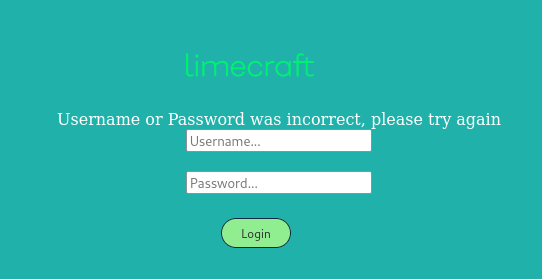
The following function authenticates our login page by checking whether the Limecraft API reports back a token or not. Without a token, the user is given a ‘failed login’ page.
<a href="http://twitter.com/server" title="Twitter profile for @server" target="_blank">@server</a>.route("/data",methods = ['GET','POST'])<br>def AuthDisplay():<br> usernam = request.form.get('username')<br> password = request.form.get('password')<br>
#Get user token<br> url = baseurl + '/login'<br> payload = json.dumps({'username': usernam, 'password': password, 'rememberMe': ><br> header = {'Content-Type': 'application/json'}<br> TokenRequest = requests.post(url, headers=header, data=payload)
if "UnauthorizedError" in str(TokenRequest.json()):<br> return render_template('failed_login.html')<br> else:<br>return render_template('dashboard.html')
if __name__ == "__main__":<br> server.run(host='0.0.0.0', port=8080)
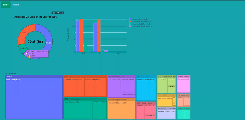
If you were to run this script now, it wouldn’t have any actual results in the dashboard, however, it will be an entirely authenticated page. This is what it looks like:
The authentication page in action:
Now that we’ve hosted our app, it’s time to start generating Visualizations.
In order to get visualizations going with Dash, it’s not that difficult, however, it does come with a caveat when one is working with Flask. Dash tends to run its own application to host its visualizations on a web host of its creation. Of course, this doesn’t create a giant hassle, however, it does complicate things downstream if we intend to visualize the same way we did with Dash only. Instead, we opted to use Plotly, which allows us to turn the graphs into Json and then input it into our HTML template, in our case (dashboard.html)
Before we do that, I will show you the visualizations we had managed to generate with Dash, and then I can explain how it all came together into a Flask webapp.
The visualizations and their scripts:
# generate a list(a tuple) of dates between a start and an end <br>today = date.today().strftime("%d-%b-%y")<br>yearago = (date.today() - timedelta(365)).strftime("%d-%b-%y")<br>startdate = datetime.strptime(str(yearago), '%d-%b-%y')<br>dates = [(startdate + timedelta(days=x)).strftime("%d-%b-%y") for x in range(0, 366)]<br>df_year = full_df[full_df["date"].isin(dates)]<br>month = 'Nov'<br>monthly_df = pd.DataFrame()<br>query = cnx.execute(f'select DISTINCT name from UserData where UserID={UserID};')<br>Names = []<br>for row in query:<br> Names.append(row[0])<br>query.close()<br>df_month = df_year[(df_year['date'].str.contains(month))][['Name', 'Volume Ingested (s)']]<br>for project in Names:<br> sum = df_month[df_month['Name'] == project].sum()<br> monthly_df = pd.concat([monthly_df, sum], ignore_index=True, axis=1)<br>monthly_df = monthly_df.transpose()<br>monthly_df = monthly_df.drop('Name', axis=1)<br>monthly_df['Name'] = Names<br>ingested_total = monthly_df['Volume Ingested (s)'].sum() / 3600<br>monthly_df['Volume Ingested (hr)'] = monthly_df['Volume Ingested (s)'] / 3600<br>monthly_df['Volume Ingested (%)'] = 100 * monthly_df['Volume Ingested (s)'] / ingested_total<br>monthly_df = monthly_df.sort_values(by=['Volume Ingested (s)'], ascending=False)
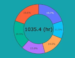
# pie chart with colume ingested<br>show_top = 5<br>pie_perc = monthly_df['Volume Ingested (hr)'].to_list()[:show_top]<br>pie_name = monthly_df['Name'].to_list()[:show_top]<br>others = np.sum(np.array(monthly_df['Volume Ingested (hr)'].to_list()[show_top:]))<br>pie_perc.append(others)<br>pie_name.append('Others')<br>fig2 = go.Figure(data=[go.Pie(labels=pie_name, values=pie_perc, hole=.6)])<br># add total value to center<br>fig2.add_annotation(x=0.5, y=0.5, text=f'{ingested_total:.1f}' + ' (hr)',<br>font=dict(size=26, family='Verdana', color='black'), showarrow=False)<br>fig2.update_layout(showlegend=False)<br>fig2.update_layout(autosize=False, width=450, height=450)<br>fig2.update_layout(title=f'Ingested Volume in hours for {month}',<br>title_font=dict(size=20, family='Verdana', color='black'), title_x=0.5)<br>fig2.update_layout({'plot_bgcolor': 'rgba(0, 0, 0, 0)', 'paper_bgcolor': 'rgba(0, 0, 0, 0)'})<br>fig2.update_traces(marker=dict(line=dict(width=1.5)))
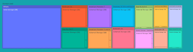
# constructing new df with tree like structure for the data storage<br>df_yesterday = full_df[full_df["date"] == yesterday]<br>data_types_mb = np.array(<br>['Date Storage (MB)', 'Proxy Storage (MB)', 'Cloud Storage (MB)', 'External Storage (MB)','Date Storage (MB)'])<br>data_types = np.array(['Date Storage (GB)', 'Proxy Storage (GB)', 'Cloud Storage (GB)', 'External Storage (GB)',Date Storage (GB)'])<br>tree_storage_df = pd.DataFrame()<br>names_tree = np.repeat(np.array(Names), 5) # extended column for all the names (all repated 5 times)<br>storage_list = []<br>total_storage_list = []<br>total_storage = 0<br>for project in Names:<br>for type in data_types_mb:<br> storage = np.array(df_yesterday[df_yesterday['Name'] == project][f'{type}'])[0]<br> storage /= 1024<br> storage_list.append(storage)<br> total_storage += storage<br> total_storage_list.append(total_storage)<br> total_storage = 0<br>total_storage_list = np.repeat(np.array(total_storage_list), 5)<br>tree_storage_df['Name'] = names_tree<br>tree_storage_df['data_type'] = np.tile(data_types, len(Names))<br>tree_storage_df['storage_used'] = storage_list<br>tree_storage_df['total_storage'] = total_storage_list<br>tree_storage_df = tree_storage_df.sort_values(by=['total_storage'], ascending=False) # sort the df<br>tree_storage_df = tree_storage_df.reset_index(drop=True)<br>other_storage_used = tree_storage_df.truncate(before=5 * 13 - 1).sum()['storage_used']<br>other_df = {'Name': 'Others', 'data_type': 'total storage (GB)', 'storage_used': other_storage_used,'total_storage': other_storage_used}<br>tree_storage_df = tree_storage_df.truncate(after=5 * 12 - 1) # keep only top 5*n most relevant projects<br>tree_storage_df = tree_storage_df.append(other_df, ignore_index=True)<br>fig = px.treemap(tree_storage_df, path=[px.Constant('Storage used'), 'Name', 'data_type'], values='storage_used',hover_data={'storage_used': ':.1f'})<br>fig.update_layout(margin=dict(t=50, l=25, r=25, b=25))<br>fig.update_layout({'plot_bgcolor': 'rgba(0, 0, 0, 0)', 'paper_bgcolor': 'rgba(0, 0, 0, 0)', })<br>fig.update_layout(autosize=False, width=1500, height=450
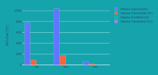
months = ['Jan', 'Feb ', 'Mar', 'Apr', 'May', 'Jun', 'Jul', 'Aug', 'Sep', 'Oct', 'Nov', 'Dec']<br>VolumeIngested = []<br>VolumeTranscribed = []<br>VolumeSubtitled = []<br>VolumeTranslated = []<br>bar_chart_dic = {}<br>for i, month in enumerate(months):<br>query = cnx.execute(f'SELECT SUM(`Volume Ingested (s)`),SUM(`Volume Transcribed (s)`),SUM(`Volume Subtitled (s)`),SUM(`Volume Translated (s)`) FROM UserData WHERE date LIKE "%%{month}%%" AND UserID="{UserID}";')<br>bar_chart_data = []<br>for row in query:<br> if row[0] is None:<br> bar_chart_data.append(0)<br> else:<br> bar_chart_data.append(float(row[0]) / 3600)<br> if row[1] is None:<br> bar_chart_data.append(0)<br> else:<br> bar_chart_data.append(float(row[1]) / 3600)<br> if row[2] is None:<br> bar_chart_data.append(0)<br> else:<br> bar_chart_data.append(float(row[2]) / 3600)<br> if row[3] is None:<br> bar_chart_data.append(0)<br> else:<br> bar_chart_data.append(float(row[3]) / 3600)<br> bar_chart_dic[months[i]] = bar_chart_data<br>query.close()<br>months = ['Oct', 'Nov', 'Dec']<br>for month in months:<br> VolumeIngested.append(bar_chart_dic[month][0])<br> VolumeTranscribed.append(bar_chart_dic[month][1])<br> VolumeSubtitled.append(bar_chart_dic[month][2])<br> VolumeTranslated.append(bar_chart_dic[month][3])<br>fig3 = go.Figure(data=[go.Bar(name='Volume ingested(hr)', x=months, y=VolumeIngested),go.Bar(name='Volume Transcribed (hr)', x=months, y=VolumeTranscribed), go.Bar(name='Volume Subtitled (hr)', x=months, y=VolumeSubtitled),<br> go.Bar(name='Volume Translated (hr))', x=months, y=VolumeTranslated)])<br># Change the bar mode<br>fig3.update_layout(barmode='group')<br>fig3.update_layout({'plot_bgcolor': 'rgba(0, 0, 0, 0)', 'paper_bgcolor': 'rgba(0, 0, 0, 0)', })<br>fig3.update_layout(barmode='group', bargap=0.15, bargroupgap=0.1, yaxis=dict(title='Volume (hr)',
This leaves us with three figures, all of which must be now hosted on Flask, using plotly express. Here is how you can put multiple figures on one page in Flask using Plotly (This has little documentation available).
If you consider that fig1, fig2 and fig3 are now all on the flask page,it should look something like this:
<a href="http://twitter.com/server" title="Twitter profile for @server" target="_blank">@server</a>.route("/data",methods = ['GET','POST'])<br>def AuthDisplay():<br> usernam = request.form.get('username')<br> password = request.form.get('password')<br> baseurl = '<a href="https://platform.limecraft.com/api%27" target="_blank">https://platform.limecraft.com/api'</a>
#Get user token<br> url = baseurl + '/login'<br> payload = json.dumps({'username': usernam, 'password': password, 'rememberMe': ><br> header = {'Content-Type': 'application/json'}<br> TokenRequest = requests.post(url, headers=header, data=payload)
if "UnauthorizedError" in str(TokenRequest.json()):<br> return render_template('failed_login.html')<br> else:<br> fig1<br> fig2<br> fig3<br> graphJSON = json.dumps(fig, cls=plotly.utils.PlotlyJSONEncoder)<br> graphJSON2 = json.dumps(fig2, cls=plotly.utils.PlotlyJSONEncoder)<br> graphJSON3 = json.dumps(fig3, cls=plotly.utils.PlotlyJSONEncoder)
return render_template('dashboard.html', Dashboard1=graphJSON, Dashboard2=graphJSON2, Dashboard3=graphJSON3)
if __name__ == "__main__":<br> server.run(host='0.0.0.0', port=8080)
Notice, how fig1 and 2 and 3 are turned into graphjson1, 2 and 3 using the PlotlyJsonEncoder. The important part here is that the figures do NOT use the Dash callback function, as that requires its own app. Using this approach now allows us to embed the graphs into the dashboard html template, which I will show in the next graph how to ready for this process.
dashboard.html:
<html><br><title> LimeCroft Prototype Dashboard Login Page </title><br><link rel="stylesheet" type="text/css" href="../static/popup.css"><br><style><br>#wrapper {<br> width: 1150px;<br>}<br>body {<br> background-color: lightgreensea;<br>}<br></style><br><a href="http://a%20href=">http://a%20href=</a><br><a href="http://a%20href=">http://a%20href=</a><br> <script><br> function cb(selection) {<br> $.getJSON({<br> url: "/callback", data: {'data': selection}, success: function (result){<br> Plotly.newPlot('chart',result, {displayModeBar: false,});;<br> }<br> });<br> }<br> </script><br><div class="topnav"><br><a class="active" href="<a href="https://platform.limecraft.com/" target="_blank">https://platform.limecraft.com/</a>">Home</a><br><a href="/adminlogin">Admin</a><br></div><br><br><br><br><br><body><br><div style="padding: 5px 5px 5px 5px;"><br></form><br></div><br><body><br><div id="wrapper"><br><div id='chart1' class='chart' style="position: relative;left:40px; top:30px;"></div><br><div id='chart2' class='chart' style="position: absolute;left: 500px; top:30px"></div><br></div><br></body>
<a href=""></a><br><script type='text/javascript'><br> var graphs3 = ;<br> Plotly.plot('chart2',graphs3,{displaylogo: false});<br> var graphs2 = ;<br> Plotly.plot('chart1',graphs2,{displaylogo: false});<br></script><br> <body><br> <div id='chart' class='chart'”></div><br></body>
<a href=""></a><br><script type='text/javascript'><br> var graphs = ;<br> Plotly.plot('chart',graphs,{displayModeBar: false});<br></script>
Notice, the JavaScript required by plotly to render the chart is run three different times, for graphjson1,2 and 3, here saved as Dashboard1,2 and 3. After putting all this together, we login and view our new dashboard.
Finally, we had two approaches to the same problem, each with their own trade-off.
Flask and Dash are tried and tested pieces of software, their scalability and versatility is well documented and many programs run using them as a back-end. However, certain simplicities provided by QuickSight could quickly be found by building on Flask, Dash and Plotly and using the end product.
For all its versatility, this approach requires a certain degree of intimacy with the software, end to end and additionally, requires diligent and specialized work to adapt to LimeCraft’s current platform. Adapting Plotly and Dash required multiple programming sessions, while modifying and creating QuickSight graphs took minutes.
QuickSight was simple to build and rebuild and worked quickly with any database we threw at it. Excel files or MySQL databases, S3 Data lakes, Data Markets, you name it. Amazon’s QuickSight offered us a quick, clean, interactive and easily replicable solution.
However, QuickSight lacked the speed and versatility of an in-house end to end solution. Although QuickSight offered the desired results, it is also entirely dependent on Amazon’s IAM to serve multiple users. However, to create a business analysis dashboard for in-house usage, QuickSight offers a robust and clean solution.
Ultimately, QuickSight proved to be a better approach to this problem, primarily due to its easy to use nature and plug&play functionalities. Its quick adaptability to all kinds of databases makes for a quick and easy experience. Additionally, QuickSight has its own user management system which one could leverage in case a pre-existent database is not directly accessible.